

One platform.
Three problems.
One root cause.
Role
Contract UX Designer
Timeline
1-week sprint
Platform
DataCalculus Web App
Status
Proposed · Not yet built
🎯 Three design scopes
🧠
AI Memory & Context
Persistent memory so the AI never forgets what
matters to the business
🗂️
Side Panel Redesign
Context-aware navigation in plain language, not
system language
🚪
Onboarding Popup
A product selection screen that non-technical users
can actually understand
⚙️ Design constraint throughout
All three solutions follow the same principle: write
for the person using the product, not the engineer
who built it.

🔍 01 — Product Context
Understanding the platform before touching anything
DataCalculus is not a general-purpose AI assistant. It is a data science automation tool;
built specifically to help business users extract insights from their own datasets without
needing technical expertise. Understanding this distinction shaped every design
decision.
📊
Data Scientist AI
Dataset-specific AI chat. Upload data, ask
questions in plain language, receive
analytical findings.
🗂️
Admin Tools
Team and account management. Entry
point for organisation-level memory
configuration.
🖼️
Visualise (ai.datacalculus.com)
Separate product — turns text, reports,
and ideas into designed infographics. No
data upload needed.
🚪 Popup scope
⚙️ The critical distinction
Two very different products share one platform entry point. A CEO arriving to analyse sales data and a marketer arriving to
turn a report into an infographic land on the same screen; with no clear signal about which path is theirs. This
observation led directly to the third design scope.
🔍 02 — Discovery
The brief — and what using the product revealed
📋 The brief from product leadership was direct: session continuity was lower than
expected. Users were engaging in their first AI session but not building on previous work
when they returned. Before reviewing any data, I spent time using the platform as a real
business user would.

👥 Three representative user profiles were researched to validate this pattern:
Marcus, 47 · CEO
Manufacturing · Monthly user
Re-establishing business context
before each session reduces the
value he gets from the tool.
🔁 Re-explains goals
Low tech comfort

Sara, 34 · Analyst
E-commerce · Weekly power user
AI behaviour is inconsistent across
her team — each member brings
their own context independently.
👥 No team context
Power user

Leila, 29 · Co-founder
B2B SaaS · Daily user
Context she builds in one session
— funnel structure, growth metrics
— does not carry into the next.
🔄 Context resets
Solo analyst
🎯 03 — Define
Four clusters. One root cause.
🔬 Research observations grouped into four themes and all four pointed to the same
structural gap underneath.
🔴 Critical — all users
🔁 Session continuity
Every session begins without reference to previous
conversations or stated goals. Users re-establish context each
time before any analysis can start.
🟠 High — all users
🎯 Relevance of outputs
AI responses are data-accurate but not oriented to the user's
actual business priorities. Without knowing the goal, the AI
cannot frame findings accordingly.
🟡 Medium — team users
👥 Team consistency
No shared organisational layer means different team members
receive independently contextualised AI responses for the
same business goals.
🟡 Medium — all users
🔍 Transparency & control
Users have no visibility into what the AI currently understands.
Sharing commercially sensitive goals into an opaque system
limits trust in the product.
📌 The root cause
The platform was designed in system language; how the engineering team categorises operations. Non-technical users
need outcome language, what they will get when they click. This single gap created every problem in the heatmap above.
🔄 04 — Where We Got It Wrong
The first idea; and why we threw it out
💡 The first design response to the AI memory problem was logical on the surface. It was
also wrong.
❌ First proposal — discarded
✗
📋 A "Business Profile" setup screen before first use
✗
📝 Structured fields: company name, goals, KPIs,
preferences
✗
😩 Asks users to articulate goals before they know what
they need
✗
🚫 Informal test result: nobody said they would complete it
Solved the right problem the wrong way. Placed the burden
on the user before they received any value.
Pivot
✅ Revised direction — adopted
✓
💬 AI detects context from natural conversation
✓
🧠 Captures goals, metrics, priorities automatically
✓
🙌 User never fills in a form — just talks to the AI
✓
👁️ Memory panel gives full visibility and control
Key insight: users already share this information when asking
analytical questions. Capture it — don't ask for it separately.
✏️ 05 — Design
Three solutions. One consistent language.
🗺️ Each design scope applied the same principle: replace system language with outcome
language. Icons were added throughout to give users a visual signal before they read a
single word.
🧠 Scope 1 — AI Memory & Context
The user flow
01
💬 Optional prompt
AI asks one context
question
02
🗣️ User shares goal
Naturally in
conversation
03
🧠 Silent capture
AI detects and saves
intent
04
✅ Quiet confirm
In-chat chip — no
interruption
05
🔄 Return session
AI applies context
automatically
06
👁️ Memory panel
Full visibility and
control
BEFORE

AFTER
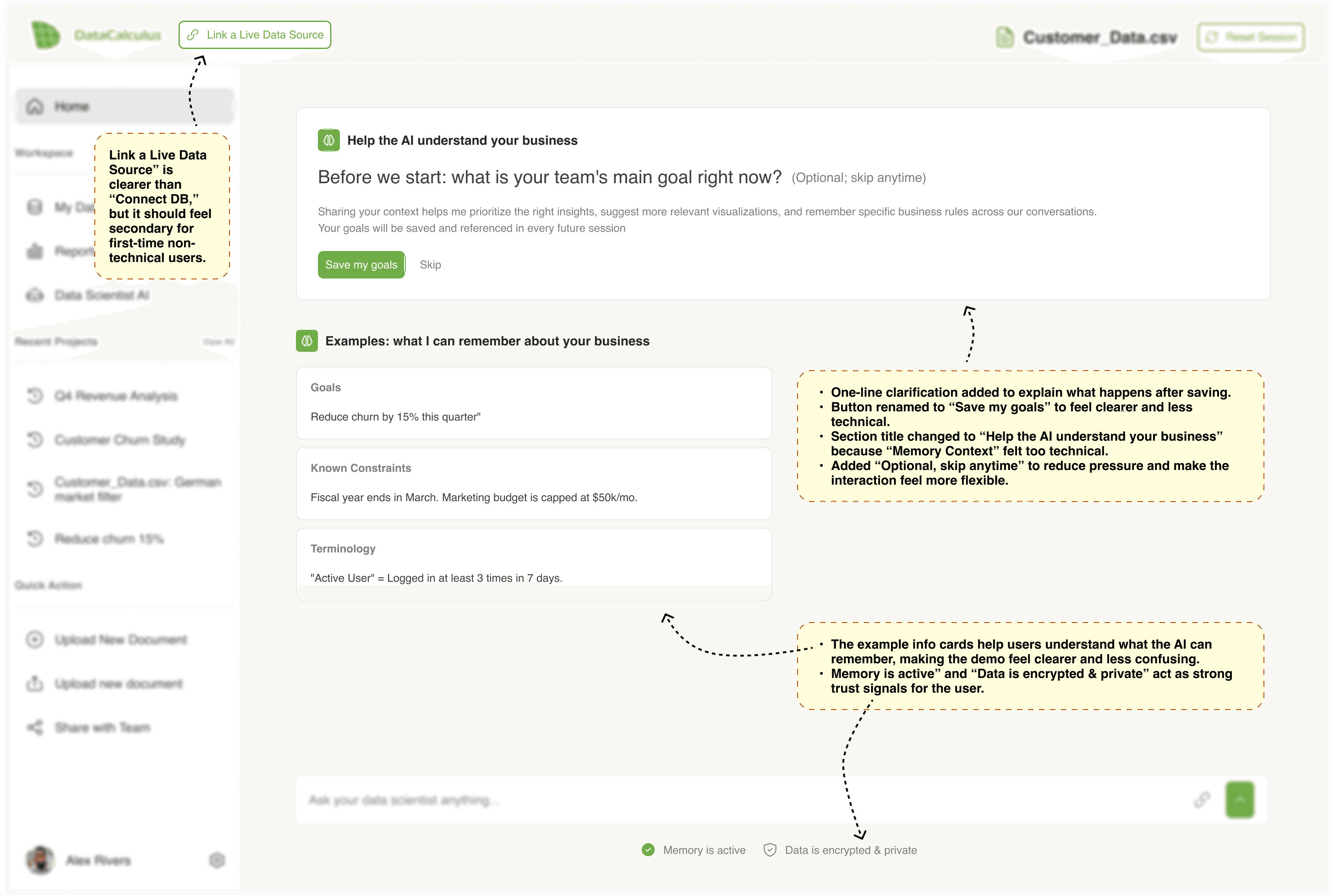
First session, capturing context without setup
Instead of forcing users into a separate setup flow, the AI asks one optional business question inside the existing chat experience. The prompt explains what will happen after saving, while example cards make memory concrete by showing goals, constraints, and terminology.
Context saved, analysis starts immediately
After the user shares a goal, the system confirms that memory has been saved without interrupting the flow. The AI then moves directly into analysis, using the saved context to reduce blank-page friction and make the first response feel more relevant.

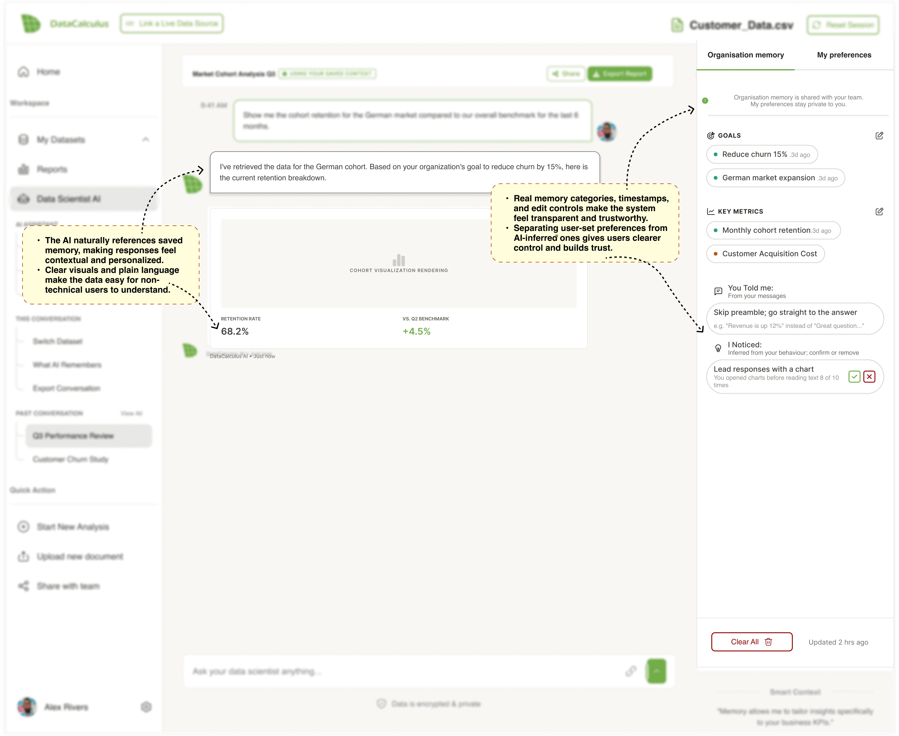
Memory used inside the answer
The AI references saved context directly in the response, showing users why the analysis is framed around churn reduction and the German cohort. A small “using your saved context” label makes memory visible without slowing down the reading experience.

Return session with Memory Panel
In a return session, saved organisational context is applied automatically. The Memory Panel opens as a transparency layer, showing which goals, metrics, and preferences are influencing the response, while giving users control to edit, confirm, or remove items.
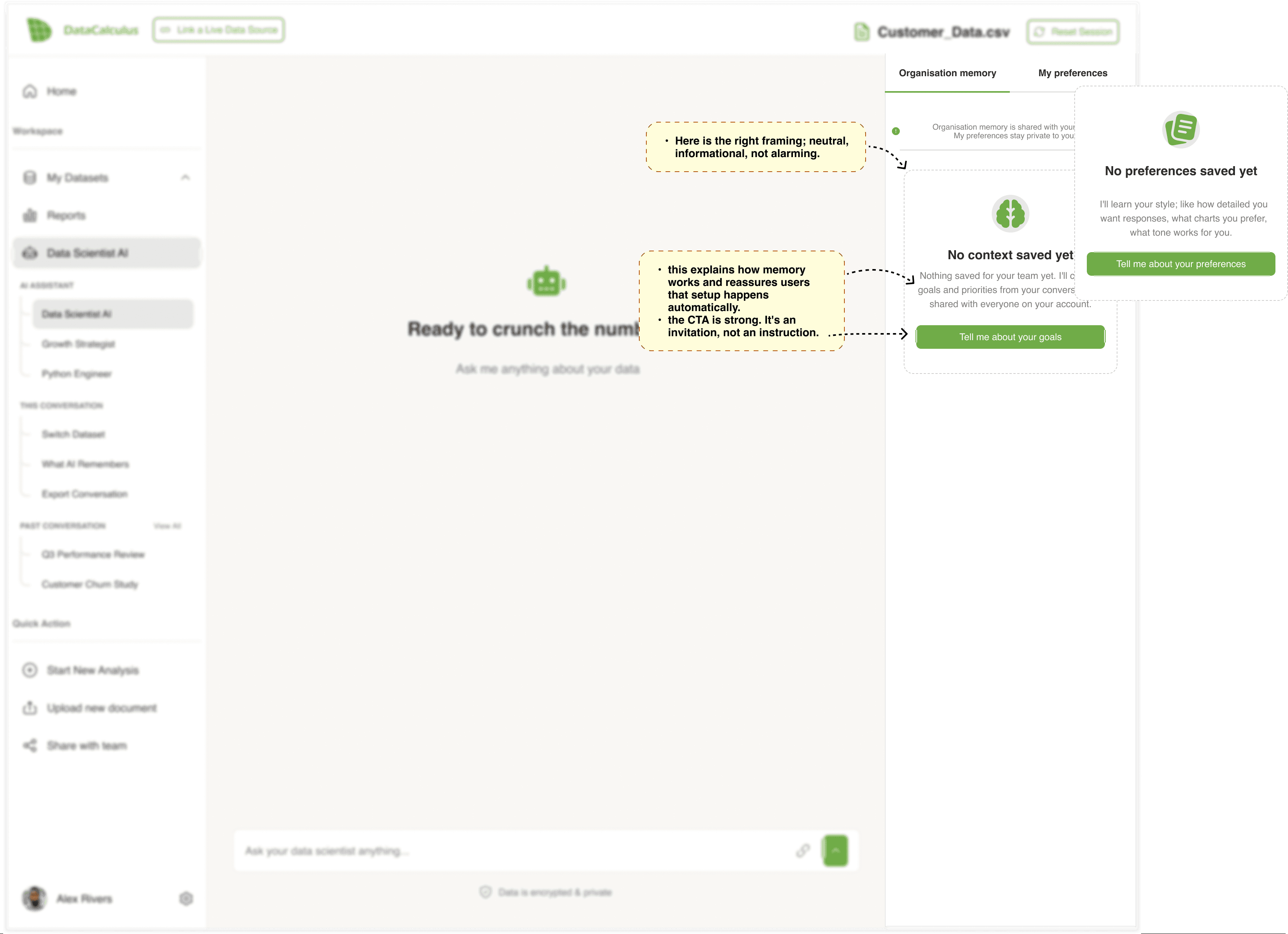
Empty memory state
When no context has been saved yet, the panel explains the feature in a neutral and reassuring way. The CTA invites users to share goals or preferences, but avoids making setup feel mandatory before they can continue using the product.
Conflicting team goals
When team goals conflict, the AI surfaces the issue instead of choosing silently. Users can select the goal that should guide the analysis, show both, or skip the decision for now, keeping the conflict visible without blocking progress.

Low-confidence analysis
When the dataset is not strong enough for a confident conclusion, the AI explains the limitation in plain language. Instead of leaving users with a warning, it provides clear next steps, such as viewing sample size details or expanding the time range.

Session-only context
Not every piece of context should become permanent memory. This state shows when the AI is using temporary session context, and gives users the option to save it only if it becomes useful for future analysis.

🧠 Memory panel — transparency layer
Organisation memory
My preferences
Organisation memory is shared with your team.
My preferences stay private to you.
Goals
Reduce churn 15% .3d ago
German market expansion .3d ago
Key Metrics
Monthly cohort retention.3d ago
Customer Acquisition Cost
You Told me:
From your messages
Skip preamble; go straight to the answer
e.g. "Revenue is up 12%" instead of "Great question..."
I Noticed:
Inferred from your behaviour; confirm or remove
Lead responses with a chart
You opened charts before reading text 8 of 10 times
Clear All
Updated 2 hrs ago
Smart Context
"Memory allows me to tailor insights specifically to your business KPIs."
👁️ Why the panel matters
Memory without visibility feels like surveillance. The
panel turns stored context into something users can
see, correct, and trust — not a black box.
🔒 Privacy default
If a user mentions a specific figure, the AI stores the
category only — not the value. Detailed storage requires
explicit opt-in.

🔀 Three scenarios we designed for
🤔
AI misreads what you said
Ambiguous capture
When the AI is uncertain whether a
statement is an active goal or
background context, it asks: "Should I
track this?" Two options: keep or
discard.
⚡
Two teammates want different things
Conflicting team goals
When two team members set
conflicting priorities, the AI surfaces
the conflict and asks which should
guide the current analysis. No silent
overrides.
🔌
Memory fails to save
Technical save failure
If memory cannot be saved, the AI
applies context for the current
session and notifies the user calmly.
The analysis continues — no dead
ends.
🗂️ Scope 2 — Side Panel Navigation Redesign
Working on the AI memory feature exposed a wider problem: the entire navigation was
written for engineers, not users. Every label — "Data Dictionary", "Bulk Operation Panel",
"Select Focus Areas" — described system operations, not user outcomes. We redesigned
all three panel states.
🔀 The language shift — what changed and why
❌ Before — system language
Data Dictionary
Overall AI Report
Select Focus Areas
Bulk Operation Panel
Memory Panel
Transfer Dataset Ownership
Chat With Dataset Followers
✅ After — outcome language
+
View Data Glossary
+
Full AI Report
+
Focus on a Specific Area
+
Quick Actions
+
What AI Remembers 🧠
+
Share & Access
+
Discuss this Dataset
➕ The "Connect DB" Button Rename
While auditing the navigation, one element in the top bar stood out as the same problem in a different location. The "Connect DB" button — sitting prominently in the header — uses an engineering abbreviation that means nothing to a non-technical user. They do not know what DB stands for, and even if they did, they would not know when or why to click it. The fix follows the same rule: rename it to "Link a Live Data Source" and move it under the "Share & Access" section in the dataset panel's Manage group — where it belongs contextually, alongside other data connection actions.
The panel changes based on what the user is doing — three context-aware states:
BEFORE


🧠 The most important rename
"Memory Panel" → "What AI Remembers" — this single label change connects the navigation directly to the AI Memory
feature. It answers the user's question before they click, and uses plain language that requires no prior knowledge of what a
"memory panel" is.
🚪 Scope 3 — Onboarding Popup Redesign
DataCalculus has two products sharing one entry point. The original popup — "Visualize
Your Ideas" vs "Analyze Your Data" — gave no indication of what each path actually meant.
A non-technical user had no way to know which one was right for them.
❌ Before — vague and jargon-heavy
What do you want to do?
Visualize Your Ideas
Analyze Your Data
Neither button tells the user what they will see next
✅ After — clear, outcome-led
What are you trying to do?
Pick the one that sounds most like your situation
Visualize Your Ideas
Analyze Your Data
📏 06 — Validate
How we define success
📏 This is a design proposal — the designs are annotated and ready for engineering
handoff but have not been built yet. Success is measured at 14 and 30 days post-launch.
40%+
🧠 Memory panel open rate
within 14 days
+20%
📈 7-day return rate vs pre-
launch baseline
−30%
✂️ Length of context-setting
messages
−50%
🎫 Support tickets citing AI
context gaps
✅ What is well-evidenced
⚠️ What requires post-launch validation
Passive memory capture depends on users naturally
sharing context in their questions. The opening prompt
is the critical activation mechanism — its adoption rate
is the biggest unknown.
🔭 Why this is out of scope — but not out of mind
A homepage redesign is a separate body of work — different research, different success metrics, different audience.
But the same principle applies: write for the person arriving, not the feature being sold. The homepage is the natural
next chapter. The language philosophy is already half-reasoned.
💡 07 — Reflection
What I would do differently — and what this taught me
💡 Four honest lessons from a one-week sprint that covered more ground than expected.
🧪 The capture moment needs a real usability test before shipping
1
2
⏰ The staleness detection design is underdeveloped
The logic that prompts users to review stored context after 60+ days was documented as a requirement but not fully designed.
It should be resolved during engineering scoping — not after build begins.
3
4
What connected all three scopes was not a design pattern — it was a language philosophy. The
platform was speaking to engineers. The users needed it to speak to them. Every decision in this
sprint was an act of translation.
🔭 What this sprint opened up
The same problem exists before users even log in
Auditing the platform's language from the inside out made one thing impossible to ignore
— the marketing homepage has the same problem we just spent a week solving inside
the app.
❌ Current homepage — feature language
What the homepage currently says
✗
One-Click Analytics
Describes the mechanism — not what the user gains
✗
Clustering Report
Technical term — a CEO has no idea what clustering means
✗
Data Dictionary
The same label we already renamed inside the app
✗
"Transform your raw data into insightful reports"
Hero headline describes the product — not the user's outcome
✅ Proposed direction — outcome language
What it should say instead
✓
Get insights from your data in minutes
Time + outcome — no technical knowledge assumed
✓
Find hidden patterns in your customer data
Replaces "Clustering Report" — same feature, human language
✓
Understand what your data actually means
Replaces "Data Dictionary" — same principle we applied inside
the app
✓
"Stop guessing. Start knowing."
Hero headline speaks to the user's frustration — not the
feature
🖥️ Proposed hero section — concept wireframe
🔭 Why this is out of scope — but not out of mind
A homepage redesign is a separate body of work, different research, different success metrics, different audience.
But the same principle applies: write for the person arriving, not the feature being sold. The homepage is the natural
next chapter. The language philosophy is already half-reasoned.