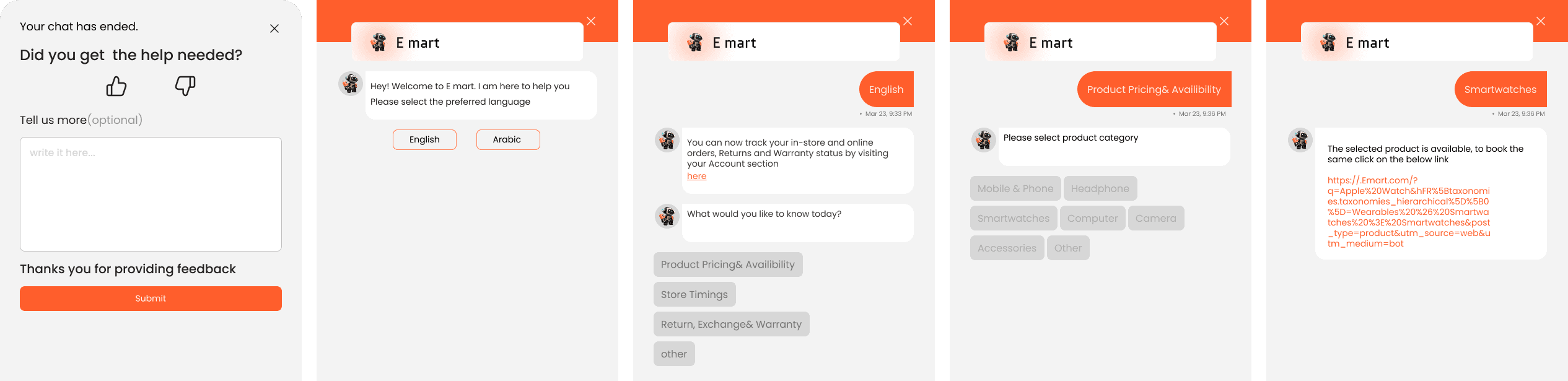
E mart
“A modern e-commerce platform for shopping electronics, gadgets, and tech accessories. I designed a clean, easy-to-navigate experience that helps users browse, compare, and buy products without getting lost in endless options.”

Project overview
The Product
Emart is an e-commerce website designed for selling electronic products such as phones, tablets, and other gadgets. The platform allows users to easily browse, compare, and purchase tech products. A key feature is the comparison tool, which helps users evaluate multiple items side by side to make informed decisions.
Product Goals
Provide a smooth and efficient shopping experience for electronic products
Help users easily compare features and prices of similar products
Increase user satisfaction, trust, and overall sales conversion
Deliver a modern and user-friendly interface tailored to tech-savvy shoppers
Target Users
Tech enthusiasts looking for the best value
Budget-conscious shoppers comparing products
People buying gadgets as gifts for others
Students and young professionals needing affordable electronics
Mission
To offer a fast, simple, and trustworthy way for users to purchase electronic products online—empowering them to make smarter buying decisions through detailed product comparisons and a clean, intuitive design.
My Responsibilities
I worked as part of a 5-person design team, where we collaborated closely on all aspects of the project. Together, we handled:
User Research
UX/UI Design
Wireframing & Prototyping
Design System Creation
Feature Design (including the comparison tool)
Usability Testing & Iteration
I was actively involved in every stage of the process, contributing to research, ideation, and design decisions throughout the project.

Project Timeline

Research
We researched several electronics e-commerce websites to understand how they work, focusing on layout, navigation, and user flow. We also studied their color schemes and visual design. This helped us choose a modern, clean style with a tech-inspired color palette that enhances usability and creates a trustworthy shopping experience.

Competitive Analyse
As a team of five, we conducted a competitive analysis of leading electronics e-commerce platforms including Amazon, Best Buy, Currys and Newegg. We focused on key areas such as homepage layout, product filtering, navigation structure, checkout flow, return/refund policies, and customer support features.


User Flow
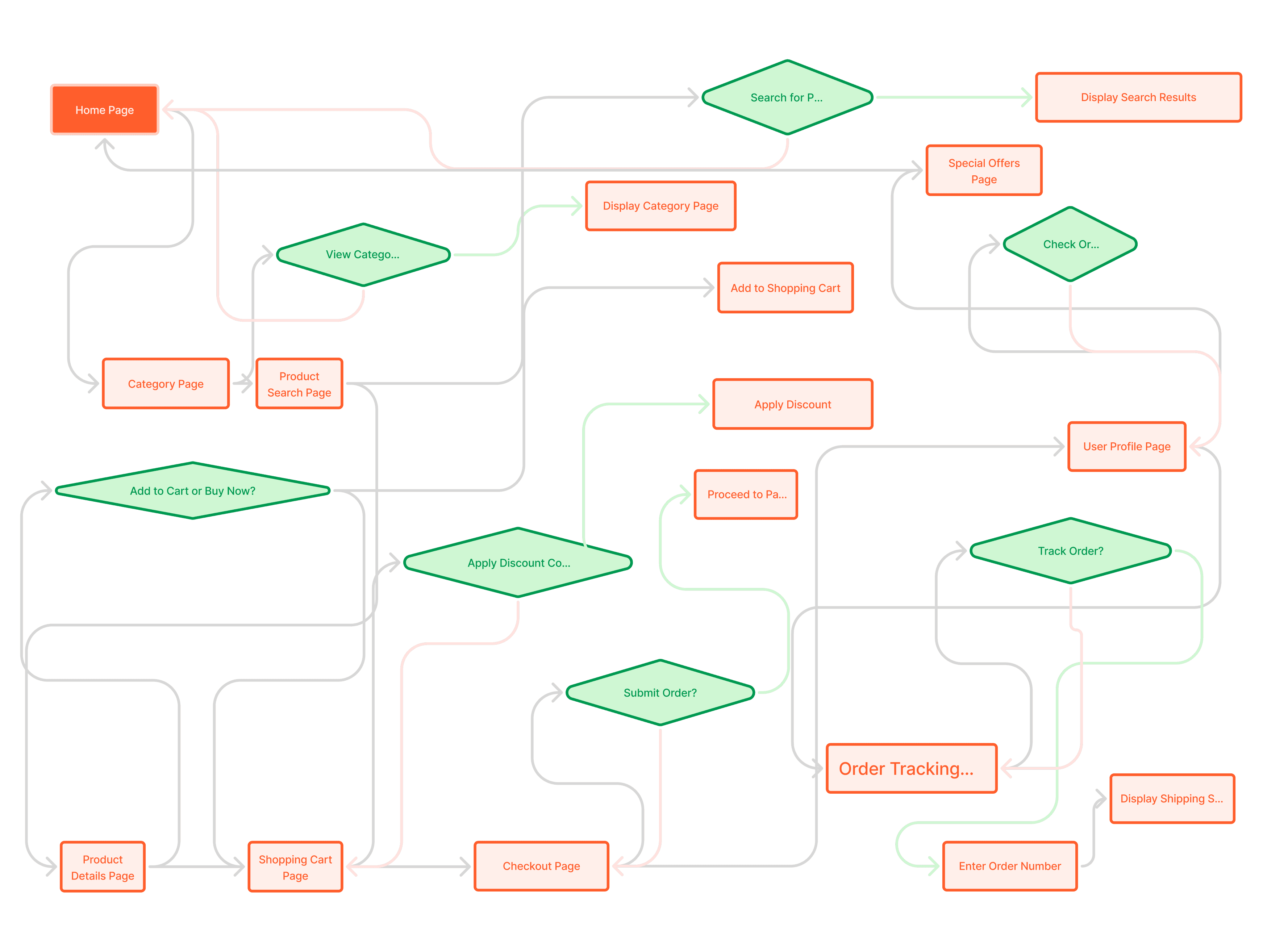
We designed user flows to map key actions such as browsing products, using filters, comparing items, adding to cart, checking out, and handling returns. These flows helped us create a smooth and logical journey, ensuring users can easily explore and compare products before making a purchase decision.
Wireframing Phase (Low-Fidelity)
At the beginning of the project, each team member was responsible for creating low-fidelity wireframes for different sections of the platform. This approach helped us generate diverse layout ideas, align on structure, and test user flows early in the process.

High-Fidelity Design Phase
Once we finalized the wireframe structure, we moved forward with designing high-fidelity mockups. As a team, we collaborated to refine the visual design, improve usability, and ensure consistency across all 50+ pages of the platform.

Style Guide
Color
I chose orange as the primary color for the Emart electronics website because it conveys energy, innovation, and enthusiasm—qualities often associated with technology and modern gadgets. Orange is also an attention-grabbing color that helps highlight key actions like "Buy Now" or "Add to Cart," enhancing user engagement and conversion. Additionally, it creates a friendly and approachable feel, making the shopping experience more enjoyable for users.

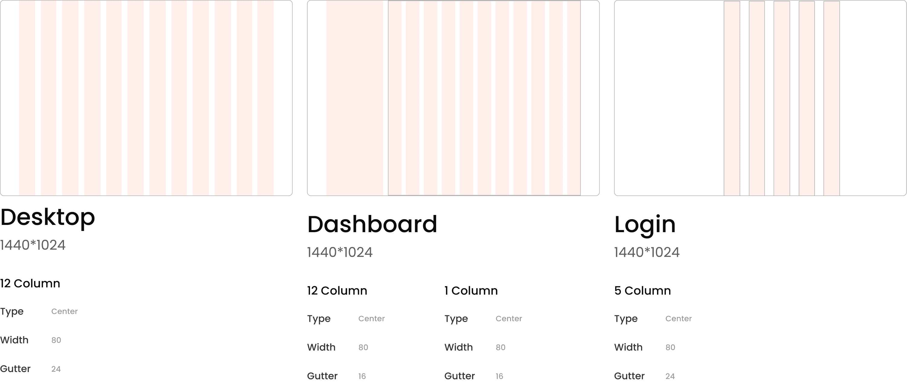
Grid
Spacing

Reniuce

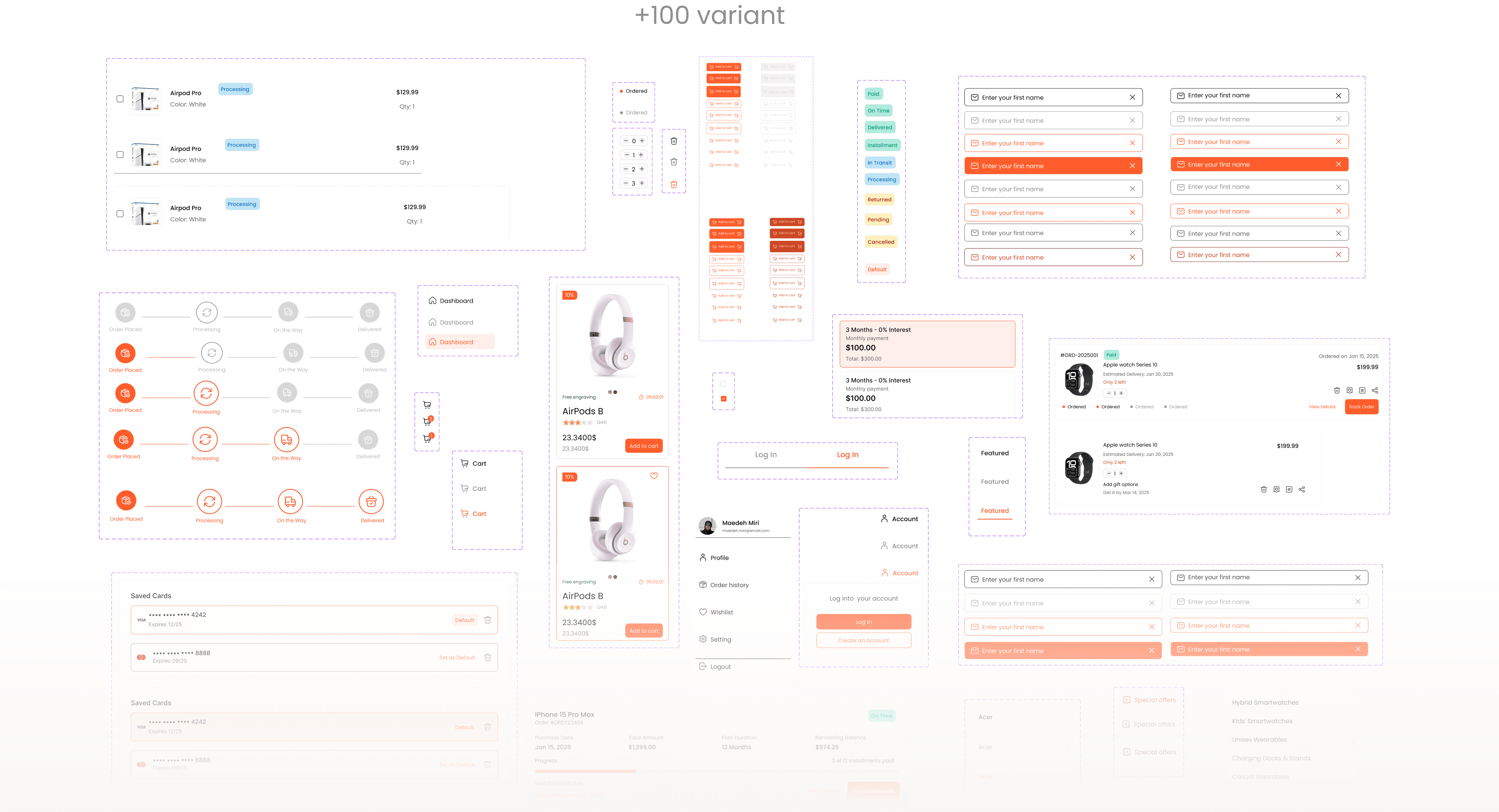
Components

Key Feature

Prototype
After completing the wireframes and visual design, I created a high-fidelity interactive prototype to simulate the full shopping experience. The prototype includes key user flows such as browsing products, using filters, viewing product details, adding items to the cart, and completing the checkout process.
I tested the prototype with users to observe how they interact with the design and to identify areas of confusion or friction. Their feedback helped me make improvements to navigation, button placement, and overall usability.
The goal of this prototype was to ensure a smooth and intuitive journey from product discovery to purchase.

Test Insight
After conducting the usability tests, I realized that integrating an AI-powered assistant or smart search feature could significantly improve the user experience.
Many users found it time-consuming to click through multiple pages to find products. By adding AI, users could simply type or speak their needs ( “I want organic milk and rice”) and receive personalized results instantly, reducing friction and making the shopping experience faster and more intuitive.